CUTwC Logos
These logos are available for CUTwC-related content: publicity, merchandise, anything not bringing the Club into disrepute.
It is the experience of the web site maintainer that the idea of having something with a Club Logo on it tends to happen when there is not a convenient time to create one. This page is intended to be a central repository so we have various designs available when needed.
Technically, there is not really an “official CUTwC logo”; alternatives exist if you prefer.
Click an image to download. Most images are in the resolution-independent SVG vector format commonly supported in the web, and should be understood by the majority of modern software. Please see the end of the page if you need vector logos converted to a PNG image (pixels). Most versions of the Pot of Winks are exceptions to this, since they are generated in pixel form.
You may also want to try your own designs in the web-based image-to-winks utility.
See also the Club Scarf and Quarter Blue.
On the choice of Cambridge Blue
Historically the web site used rgb(163,193,173) (0xA3C1AD: ) as “Cambridge Blue” based on the CU Identity Guidelines — but that document no longer seems to be online; it is referred to as “Cambridge Admin Blue” by The Hawks Club.
The site (and logos) have since moved to the darker rgb(133,176,154) (0x85B09A: ) which is supposed to be “Heritage Cambridge Blue” according to the CU Identity Guidelines (8th edition) and Brand Resources and used for merchandise; it should be Pantone 557C.
The Hawks Club article notes the C.U.B.C. blue as rgb(155,190,169) (0x9BBEA9: ) which is visibly less green, and that the C.U.R.F.C. blue has even less yellow — that the C.U.B.C. version had yellow deliberately added to distinguish it from the C.U.R.F.C. blue. (From the C.U.R.F.C. web site, this seems to be something like rgb(159,194,200) or 0x9FC2C8: ).
Note that some Club and Quarter Blue scarves and umbrellas seem closer to the R.F.C. version, but may be an unrelated (more saturated, possibly less green) shade of cyan.
CUTwC text logo (2020)
The text logo should be used where the name “CUTwC” is significant and where the association with tiddlywinks is non-obvious (where a more abstract logo would be meaningless). Used inline in text, the height of the text in the logo should match the height of capital lettering in the surrounding font. The logo should not be used below the size where the lettering can be distinguished; the “16px” height used in the inline colour logo on the home page is probably near the limit. For smaller text height consider the “CUTWC” wink text, below. The colour version of both is obviously preferred, since it makes the wink stand out and contains the Cambridge Blue reference.


“Tw” abbreviation
The “Tw” abbreviation may be useful as a narrower marker to complement the full name. It is probably too abstract to be used without the “CUTwC” logo providing context, but unlike the other designs it is clearly derived from the full “CUTwC” version.


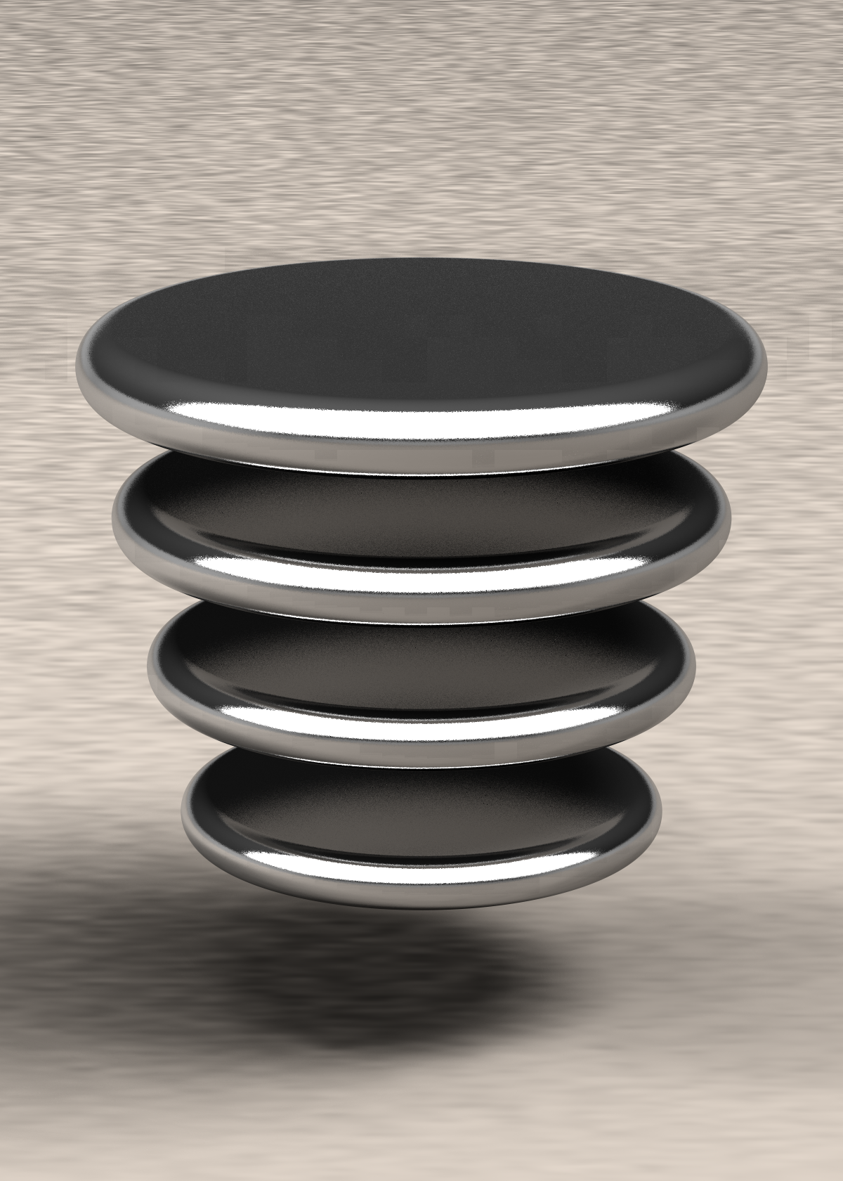
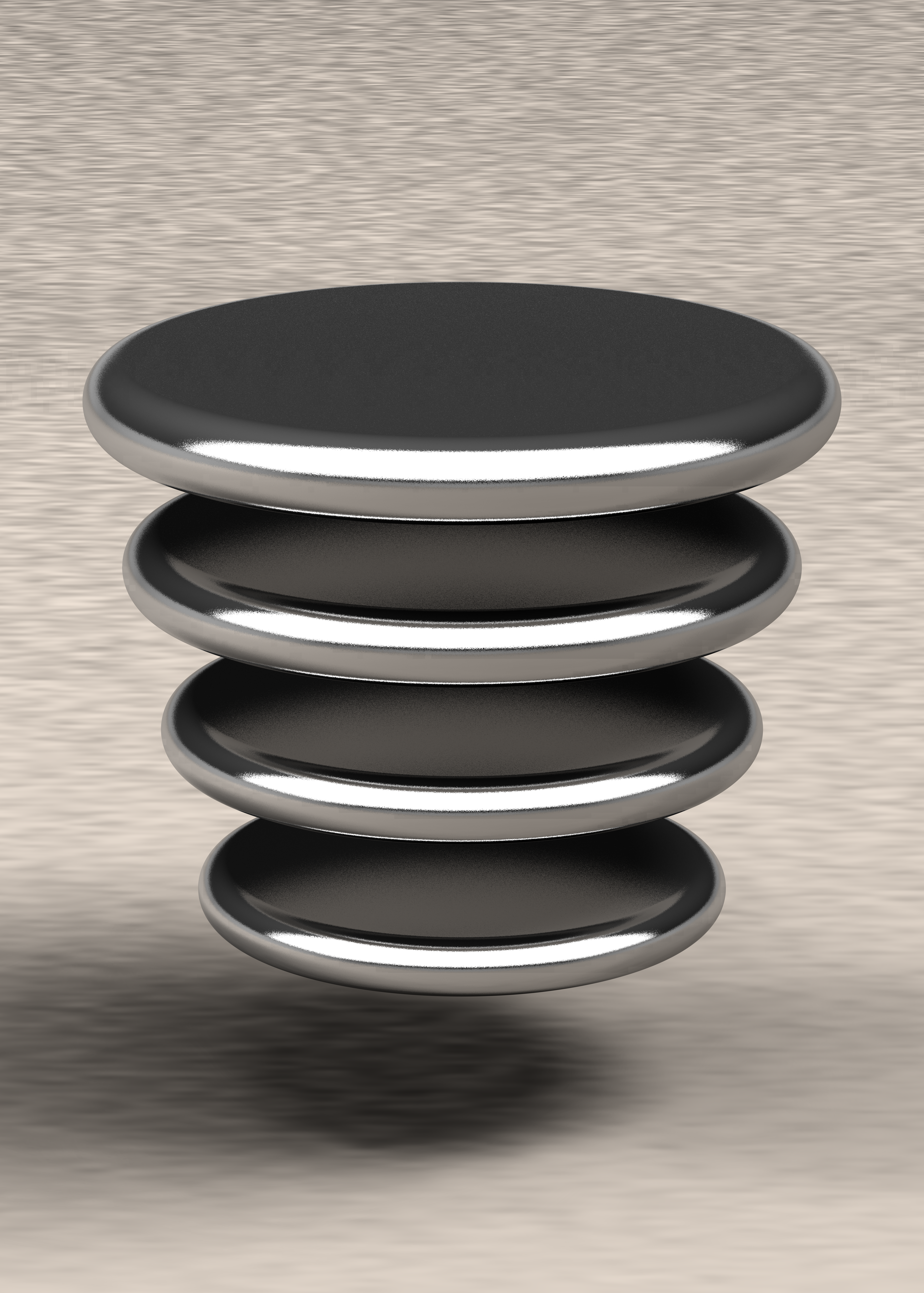
The Pot-of-Winks (2020-2024)
Colour
Glow
Theme
File format
| Clear background | Solid background | ||

Desktop backgrounds (colour only)


Macbook resolutions
| Larger Text | More Space |
||||
|---|---|---|---|---|---|
| MacBook Pro | |||||
| Apple Silicon 16” | |||||
| Apple Silicon 14” | |||||
| Intel 16” | |||||
| Intel 15” (retina) | |||||
| 13” (retina) | |||||
| MacBook Air | |||||
| Apple Silicon 15” | |||||
| Apple Silicon 13” | |||||
| Apple Silicon M1/Intel 13” | |||||
| MacBook | |||||
| Intel 12” | |||||


Resolution-independent vector art versions
While the pot of winks works best as a “realistic” image, not all printing processes support a full range of colours. In some cases one of the alternative logos would be a better option, but for consistency of branding, simplified forms are available. Note that, without the colours drawing the connection to winks, the polite objects that the monochrome ones resemble are some designs of bottle stopper or honey dipper, and they resemble... some other objects commonly described as “ribbed”... as well, so please think carefully before using them and ensure that the context is obvious.
The “realistic” versions are hand-drawn to approximate the 3D-rendered version (if you don’t look too closely).
These are all resolution-independent line art without backgrounds; see the PNG generator if you need a specific resolution, and use the “theme” toggle to choose between colours for use on light and dark backgrounds.
Theme
")
")
e.g. stickers
")
")
e.g. embroidery or enamel
")
")
dark-on-light
")
")
")
")
")
")
Half-toned versions for printing/merchandise (large files!)
These use a half-tone pattern for the glow, which may simplify printing (e.g. T-shirts).
The glow is always present; use options above to select monochrome vs colour, light vs dark theme and image format.
Halftone size
Theme
Background
Format

On the Pot-of-Winks
Note on history
In 2023 it was noticed that the aspect ratio of the original “pot of winks” was incorrect.
In 2024 some more maths was done, and 2023 version was also found to be incorrect.
Expectation that the 2024 version will also be found to be somehow wrong (especially when we get new winks), the build process is now automated.
Predictably, in 2025 it was noted (while customising a design (larger) for a 2025 platinum edition) that the finish of the winks surface should probably be using the PoVRay “bumps” function, not “ripples”, and the area lights should probably be using the “area_illumination on” setting. This has not yet been a good enough reason to re-render everything.
The “pot made of winks” logo is a more abstract design, relies on colour, and particularly only has a CUTwC connection if combined with a Cambridge Blue glow — the “realistic” version is also pixel art, which can be practically inconvenient. It conveniently doubles as a “layered” image as a mild visual pun for the home page link of the web site, and it’s a more convenient logo shape than some alternatives; it also has enough detail for large viewing while being identifiable at very small scale (e.g. as a favicon).
So long as full colour is available, the Pot-of-Winks is a recommended option in situations where an abstract logo is appropriate, and in particular where a square aspect logo is needed.
POVRay source
for the ray-traced images is available, along with the
bash script
that uses it to generate all the variants.
Note that the half-toned versions rely on
thresholds.xml
being in $HOME/.magick.
For the obsessively interested, these thresholds are generated from
makedither.c.
Regarding sizes
The nature of the design means that different variants will be
suitable for different uses.
Please try to use a minimum of
16×16
pixels (preferably
24×24)
or 1cm height (whichever is larger) to preserve visible detail unless
the image is used to complement/echo a larger version of the logo
(e.g. as custom bullet points where a larger logo on the same page
explains the small blurry image).
The pixel art approach means file size vary with the amount of detail; small files are pixellated/blurry when enlarged, and detailed versions are large files. Please try to pick a suitable resolution — the web site banner picks adaptively, for example.
Regarding the glow
- Part of image
- The glow effect is actually part of the image itself, using transparency. This has some disadvantages, but is likely the most flexible.
- Space left in image
- There is no glow in the image, but the image has enough padding (roughly 20% compared with the size of the winks) to include it. A suitable CSS filter for adding the glow is shown for the square designs with transparent formats.
- Tightly cropped
- There is no glow in the image, and the actual pot fills the image area. A suitable CSS filter for adding the glow (outside the image) in HTML is shown for the square designs with transparent formats. This crop means some of the image sizes differ from the other two cases. This approach means the glow can overlap other page elements, which enlarges the logo proper compared with the space it takes up.
- The CSS filter behaviour is not 100% consistent across implementations, but can be useful for integrating with other design features.
- The blue is one official definition of Cambridge Blue. There have been several, re-rendering will take several hours, and the result may be less bright, so efforts to keep up with the latest whim have been limited.
See the half-tone versions if the glow effect is desirable but there is no support for partial transparency (which may be the case, for example, when printing on a T-shirt or other merchandise).
Regarding dark vs light backgrounds
The eye adapts to the surrounding colour; this means that the same design may look too light or too dark depending on what it is presented on. For this reason there are two variations of the designs, with a lighter version (strictly a different gamma curve) used where the background is expected to be a light colour.
The file formats with solid backgrounds have an appropriate winks mat design for the requested background colour; for file formats with clear backgrounds the light vs dark setting only affects the winks.
Regarding monochrome
The monochrome versions use the same shade of grey for all of the winks, since a direct conversion from colour can look a little strange out of context. Note that this also affects the colour of a glow that’s part of the image (but not glow added as a rendering style). The monochrome versions are expected to be used for printing, so desktop backdrops are not available in monochrome.
Regarding file formats
PNG is a widely-supported lossless image format which includes support for transparency, which allows the logo to blend with whatever background is available.
WebP is a newer format that provides better compression than PNG while retaining the same lossless quality; if your software supports it, this will give you smaller files.
JPEG is a lossy format designed for photographic images, and does not (normally) support transparency. These files have a mat pattern as an opaque background, and are compressed to a smaller size at the cost of some reduction in image quality.
WebP also supports lossy compression, with a better size-to-quality ratio than JPEG. There is therefore also an opaque version of the designs that uses WebP in lossy mode, which will have lower quality than the lossless versions and uses a mat pattern as a background.
Desktop backgrounds
Obviously you want this logo as a desktop backdrop, right?
Four options are available for each supported display resolution, distinguished by whether the display is in landscape or portrait orientation and by whether the image should cover the entire display area or be fully contained within it. Desktop backgrounds are not provided for monochrome mode.
“CUTwink” (2024)
This “logo” incorporates colours of winks, as a wink, with a Cambridge Blue overlay. This is very abstract, and probably most useful as accents or bullet points.
Note that that, while this seems resolution-independent on Chrome, the lighting effect seems to vary with scale on Safari and not appear at all on Firefox. More tuning may be necessary if portability matters; see the PNG generator (but not on Firefox).

“CUTWC” wink text (2021)


On when this version is appropriate
The “CUTwC text logo” above has sensible-looking lettering, a clear tiddlywink, and a little bit of a visual pun in the pot effect — it works as a stand-alone design. However, for plain text uses, it is a little tall, and this can be inconvenient; it is also “a logo” of itself, which is distracting as an adjuct to other designs where lettering (with some mild branding) is more important — such as adding a reference to the name of the Club to the Pot-of-Winks or Pot Rampant.
For situations that require wider, plainer wording (such as banners), there is an alternative design based on circles (hence a tenuous tiddlywinks connection); apparently Bauhaus/geometric designs are popular at the moment, too. The coloured version “works” only at larger sizes (like a banner) — it is too visually “busy” otherwise, but adds some visual interest at scale (like graffiti). Other versions work acceptably as text alongside a logo, since their design is more clearly textual and less graphical. Please ensure sufficient contrast (which will depend on size) for the solid logo. Consider the mono logo where an extremely short logo is needed (including inlining a logo in text with a small font), since it is distinguishable at smaller vertical sizes than the pot-of-winks or CUTwC text logos.
Pure CSS version
It has come to the web site maintainer’s attention that embedded images in emails don’t work as well as you’d hope, which is a pain if you want a logo in a signature. However, there’s a chance that some basic CSS styling will. To that end, here’s approximately the same logo described in CSS border terms (sadly the sizes have to be chosen to be integer pixels, or rounding errors make the result inconsistent, so it’s a little larger than ideal):
The source for that, should you wish to past it into an email program, is:
<style>.cutwclogo_container {position:relative;border-color:#85B09A;width:170px;height:32px;display:inline-block;} .cutwclogo_c1 {position:absolute;width:0px;height:0px;border:16px solid;border-color:inherit;border-right-color:transparent;border-radius:16px;left:0px;top:0px;} .cutwclogo_u1 {position:absolute;width:0px;height:0px;border:solid;border-color:inherit;border-width:0 16px 14px 16px;border-bottom-left-radius:16px 14px;border-bottom-right-radius:16px 14px;left:31px;top:18px;} .cutwclogo_u2 {position:absolute;width:0px;height:0px;border:solid;border-color:inherit;border-width:9px 7px 9px 7px;left:31px;top:0px;} .cutwclogo_t1 {position:absolute;width:0px;height:0px;border:solid 7px;border-color:inherit;left:49px;top:0px;} .cutwclogo_t2 {position:absolute;width:0px;height:0px;border:solid;border-color:inherit;border-width:16px 7px 16px 7px;left:67px;top:0px;} .cutwclogo_t3 {position:absolute;width:0px;height:0px;border:solid 7px;border-color:inherit;left:85px;top:0px;} .cutwclogo_w1 {position:absolute;width:0px;height:0px;border:solid;border-color:inherit;border-width:0 16px 14px 16px;border-bottom-left-radius:16px 14px;border-bottom-right-radius:16px 14px;left:85px;top:18px;} .cutwclogo_w2 {position:absolute;width:0px;height:0px;border:solid;border-color:inherit;border-width:0 16px 14px 16px;border-bottom-left-radius:16px 14px;border-bottom-right-radius:16px 14px;left:103px;top:18px;} .cutwclogo_w3 {position:absolute;width:0px;height:0px;border:solid;border-width:9px 7px 9px 7px;border-color:inherit;left:103px;top:0px;} .cutwclogo_w4 {position:absolute;width:0px;height:0px;border:solid;border-width:9px 7px 9px 7px;border-color:inherit;left:121px;top:0px;} .cutwclogo_c2 {position:absolute;width:0px;height:0px;border:16px solid;border-color:inherit;border-right-color:transparent;border-radius:16px;left:139px;top:0px;} </style><span class="cutwclogo_container"><span class="cutwclogo_c1"></span><span class="cutwclogo_u1"></span><span class="cutwclogo_u2"></span><span class="cutwclogo_t1"></span><span class="cutwclogo_t2"></span><span class="cutwclogo_t3"></span><span class="cutwclogo_w1"></span><span class="cutwclogo_w2"></span><span class="cutwclogo_w3"></span><span class="cutwclogo_w4"></span><span class="cutwclogo_c2"></span></span>(Change the "#85B09A" to "black" or "white" if you need a monochrome version.)
The Pot Rampant (1980s)
The Pot Rampant has been used as a logo since the 1980s. This was reconsidered
relatively recently on the basis that it’s not clearly associated with Cambridge
and also doesn’t scale either up (in terms of being simplistic) or down (in terms
of retaining distinguishable features:
![]() — c.f.
— c.f. ![]() ) particularly well.
It remains appropriate in historical references.
) particularly well.
It remains appropriate in historical references.
")
")
")
")
Historical logos (1960s)
These logos date back to CUTwC events in the 1960s (notably ties and early
Winkings World), and remain appropriate in reference to historical events.
They presumably refer more to the excitement surrounding new-fangled nuclear
energy than to the actual shape of a pot at the time. Unfortunately they
scale to small sizes very badly (e.g.
![]() and
and
![]() ).
).
")
")
")
")
")
Background mat
The CUTwC site background is provided in case it’s useful for presentations, slides, etc. The dark mode of the web site uses CSS to darken the light version, which saves space and cache (it avoids a reload when the site colours are changed), but a manually-generated dark version is provided here where that is not an option.


How the mat was made
For historical interest: This background is arranged to tile in both dimensions by using the coordinates to trace loops in four-dimensional space as an input to a Perlin noise function (with different scales in different dimensions to represent the way a mat is squashed when it is rolled up). The plane was shaded by rendering it on custom ray tracing hardware in the 1990s (possibly the noise function actually perturbed a normal and some lighting was applied, I’ve forgotten), and then “hairs” were drawn on manually and the result heavily compressed. It’s also been tweaked a couple of times to better represent the colour of an actual felt winks mat. Needless to say, it is heavily over-engineered even by the standards of this site.
The ETwA logo
📎 You seem to be looking for a logo for Cambridge University Tiddlywinks Club.
Did you mean to look for a logo for the English Tiddlywinks Association?
")
")
")
The crest of SEPTIC

QR code
The following QR codes point to winks websites. (Not strictly logos, but included here because they’re likely to be needed in similar circumstances).


These variants have slightly better error correction, at the cost of SHOUTING
They might therefore be superior for situations where scanning the QR code might otherwise be tricky due to distortion or blotchiness — T-shirts, pint glasses, tattoos, etc...


Artistic “QArt” variants of the QR codes
Note: These are mildly academically interesting because they preserve the error correction of the QR code, rather than some approaches that just splat an image over the code and rely on the error correction to undo the mess.


Claycode

PNG generator
For convenience, this form converts the vector logos above to a requested size (and background colour), which can then be downloaded as a png (click the image). This conversion is performed entirely in your browser, so don’t blame me if the size you request is too big. Users of Firefox have the option to turn off antialiasing in this conversion (causing jagged edges but avoiding intermediate pixel colours).